Abstract
Introduction
The Cerrado region is a savanna that covers 20% of Brazil's interior. This hotspot is known for its woody plants, endemic birds and other wildlife, a prominent dry season and fire ecology. The Cerrado is unlike any other place in the world and within the past 50 years, the expansion of agriculture has brought human settlement into the region. Currently, human use has increased to 50% of the Cerrado region. The push for agriculture in the area is greatly endangering the Cerrado's native vegetation and wildlife. Research was conducted using a smaller sample of the Cerrado, Emas National Park to observe more closely, the influence agriculture has made in the region. In comparing Landsat images from 1989 to 2006, the natural vegetation of Emas National Park was surveyed, in studying the night light imagery of Brazil from 1992 to 2006, the movement of human settlement to the interior is shown and by tracking fire data around Emas National Park from 2001 to 2010 an increase in fires in the area can be observed.
Introduction
The study site for our research project is the Cerrado region in Brazil. It is located in the center of Brazil, particularly in the states Goias and Minas Gerais. The Cerrado is the most extensive savanna/woodland, savanna and dry forest region in South America making up one fifth of Brazil's surface area (Oliveria). The Cerrado is the only hotspot of its kind, with its prominent dry season it has an impressive display of drought and fire adapted plants and endemic birds. It receives rainfall between October and April, the rest of the year is the dry season. Fires are common in the area, and is an important part of the Cerrado's ecology. Since the 1950's the Brazilian government encouraged it citizens to move into the interior of Brazil and in the 1970's and 1980's the Cerrado became an agricultural frontier. After soil restoration, the Cerrado region turned into the most productive and competitive area for crop production. The increase in agricultural production in the area has resulted in 37.3% of the Cerrado being converted to human use and 41.4% is used for pasture and charcoal production. Of the original 2,031,990 square kilometers, only 21%, 438, 910 square kilometers exists today, and less than 3% is under legal protection (Conservation International). The particular park being observed in our investigation of the impact of agriculture on the Cerrado is Emas National Park. Located in the states Goias and Mato Grosso, Emas National Park is under great threat by he effects of large scale agriculture. By measuring "greenness", studying fire data, and nightlight data, our research is to measure the effects of agriculture on the Cerrado through studying Emas National Park.
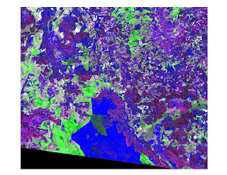
This image is of Landsat satellite image, using NDVI to measure "greenness" and density slice to survey the green cover which is highlighted in blue.
Oliveria, Paulo. Marquis, Robert."Introduction: Development of Research in the Cerrados." The Cerrados Of Brazil: Ecology and Natural History of a Neotropical Savanna. By Paulo Oliveira and Robert Marquis. New York: Columbia University Press, 2002. Vii-12. Google Books. Web. 28 Nov. 2010..
"Biodiversity Hotspots - Cerrado." Biodiversity Hotspots - Home. Conservation International. Web. 30 Nov. 2010..
Silveira, Leandro, Flávio Henrique, G. Rodrigues, Anah Tereza De Almeida Jácomo, and José Alexandre F. Diniz Filho. "Impact of Wildfires on the Megafauna of Emas National Park, Central Brazil." Oryx 33.02 (1999): 108-13. Web. 30 Nov. 2010..
Results
We compared the night light data of Brazil using data from 1992 and 2006. It can be seen that human settlement has dramatically increased in the interior of Brazil and moving into the Cerrado. This night light data is evidence that humans have settled in the Cerrado more and more each year, further endangering the habitat. 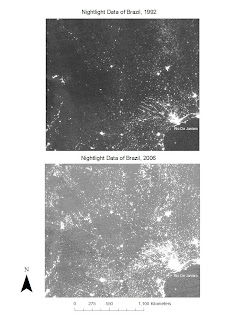 FIRE Data
The data above and in the previous post illustrate Emas National Park and the surrounding areas, with fires from the month of September (during the peak of the dry season) depicted in each image. Fires are a natural component of the Cerrado ecosystem, playing an important role in the cycling of nutrients and the clearing of dry and dead debris, which paves the way for new growth.
The pattern of fire distribution throughout the study area is highly variable, but one can see a general increase in the number of fires throughout from 2001 until 2010. There are some discrepancies regarding the fire data attained because it does not specify how the fires started. Although fire is a natural occurrence in the Cerrado, fire is also a means of clearing the land for agriculture. The increase in fires from 2001 to 2010 could be a result of an increase in fires started by humans to clear for agriculture or it could be natural, or a combination of both is leading to an overall increase in fires in the region.
Discussion
There is not an extensive amount of research conducted about the Cerrado outside of studies performed by Brazilian scientists, and those are in Portugese. We did however, find a study that is more broad than ours translated into English by the University of Brazil, Department of Ecology that researched the impact on soils and water as well as vegetation titled "Conservation of the Brazilian Cerrado."
 FIRE Data
The data above and in the previous post illustrate Emas National Park and the surrounding areas, with fires from the month of September (during the peak of the dry season) depicted in each image. Fires are a natural component of the Cerrado ecosystem, playing an important role in the cycling of nutrients and the clearing of dry and dead debris, which paves the way for new growth.
The pattern of fire distribution throughout the study area is highly variable, but one can see a general increase in the number of fires throughout from 2001 until 2010. There are some discrepancies regarding the fire data attained because it does not specify how the fires started. Although fire is a natural occurrence in the Cerrado, fire is also a means of clearing the land for agriculture. The increase in fires from 2001 to 2010 could be a result of an increase in fires started by humans to clear for agriculture or it could be natural, or a combination of both is leading to an overall increase in fires in the region.
Discussion
There is not an extensive amount of research conducted about the Cerrado outside of studies performed by Brazilian scientists, and those are in Portugese. We did however, find a study that is more broad than ours translated into English by the University of Brazil, Department of Ecology that researched the impact on soils and water as well as vegetation titled "Conservation of the Brazilian Cerrado."

This image is of Landsat satellite image, using NDVI to measure "greenness" and density slice to survey the green cover which is highlighted in blue.
Oliveria, Paulo. Marquis, Robert."Introduction: Development of Research in the Cerrados." The Cerrados Of Brazil: Ecology and Natural History of a Neotropical Savanna. By Paulo Oliveira and Robert Marquis. New York: Columbia University Press, 2002. Vii-12. Google Books. Web. 28 Nov. 2010.
"Biodiversity Hotspots - Cerrado." Biodiversity Hotspots - Home. Conservation International. Web. 30 Nov. 2010.
Silveira, Leandro, Flávio Henrique, G. Rodrigues, Anah Tereza De Almeida Jácomo, and José Alexandre F. Diniz Filho. "Impact of Wildfires on the Megafauna of Emas National Park, Central Brazil." Oryx 33.02 (1999): 108-13. Web. 30 Nov. 2010.


