Wednesday, April 21, 2010
Lab #3
View Los Angeles Dodgers Starter's Hometowns in a larger map
This map shows the hometown's of the Los Angeles Dodgers starting lineup.
Neogeography has a lot of potential. The maps that have been created by an average person can often be useful by perhaps showing more insight than cartographer who is just mapping for a location. It can include pictures, videos, reviews, descriptions, and other points of interest useful for the everyday person to find something in particular they are looking for.
However, looking at it from the other side, Neogeography has it's pitfalls. The fact that these maps are made by everyday people, who are inexperienced in map making, can have some negative consequences as well. The locations and information are more opinion-based than fact-based, and some of the information can be wrong because it is not monitored or checked for legitimacy. The same personal touch that can be useful, can be misleading at times. For instance, in my map I could have put the wrong hometown for any one of those people (I didn't!) but you would think it was true unless you checked for the information yourself.
The consequences of Neogeography are that in today's world you can find almost any location by the click of a phone/computer/GPS. Sites like Mapquest, Google Maps, and more informative sites using mashups like Yelp and Urban Spoon provide more information than people could have ever imagined 20 years ago. This new type of geography has provided the knowledge of GIS and the experience of the average person into a more helpful type of map making.
Thursday, April 8, 2010
Lab #2
1. What is the name of the quadrangle? Beverly Hills
2. What are the names of the adjacent quadrangles? Canoga Park, Van Nuys, Burbank, Topanga, Hollywood, Venice, Inglewood.
3. When was the quadrangle first created? 1966
4. What datum was used to create your map? Vertical: North American Datum of 1927, Horizontal: North American Datum of 1983
5. What is the scale of the map? 1:24 000
6. At the above scale, answer the following:
a) 5 centimeters on the map is equivalent to how many meters on the ground? 1200 m on the ground
b) 5 inches on the map is equivalent to how many miles on the ground? 1.894 miles on the ground
c) one mile on the ground is equivalent to how many inches on the map? 2.64 inches
d) three kilometers on the ground is equivalent to how many centimeters on the map? 12.5 cm
7. What is the contour interval on your map? 20 ft
8. What are the approximate geographic coordinates in both
degrees/minutes/seconds and decimal degrees of:
a) the Public Affairs Building;
34°4'30" N, 118°26'15" W/ (34.075, -118.4375)
b) the tip of Santa Monica pier;
34°00'30" N, 118°30'00" W/ (34.008, -118.500)
c) the Upper Franklin Canyon Reservoir;
34°7'05" N, 118°24'30"W/ (34.118, -118.408)
9. What is the approximate elevation in both feet and meters of:
a) Greystone Mansion (in Greystone Park); 560ft/170.688m
b) Woodlawn Cemetery; 140ft/42.672m
c) Crestwood Hills Park; 625ft/190.5m
10. What is the UTM zone of the map? 11
11. What are the UTM coordinates for the lower left corner of your map?
3763000 N, 362000 E
12. How many square meters are contained within each cell (square) of the UTM gridlines?
1,000,000 meters squared
13. Obtain elevation measurements, from west to east along the UTM northing 3771000, where the eastings of the UTM grid intersect the northing. Create an elevation profile using these measurements in Excel (hint: create a line chart). Figure out how to label the elevation values to the two measurements on campus. Insert your elevation profile as a graphic in your blog.
Making charts is hard :[
14. What is the magnetic declination of the map? 14° E
15. In which direction does water flow in the intermittent stream between the 405 freeway and Stone Canyon Reservoir? it flows from north to south
16. Crop out (i.e., cut and paste) UCLA from the map and include it as a graphic on your blog.

Thursday, April 1, 2010
Lab #1

I found this map by searching for old maps of Los Angeles County on this website : http://www.wrd.org/engineering/historic-groundwater-los-angeles.php. This map shows contours for groundwater elevation in 1904. At this time there was so much groundwater in the area that much of the LA basin had flowing artesian wells. This map first grabbed my attention by its antique look and green shades. It had contour lines to shows the levels groundwater, lines that show streets of the time, and the Newport- Inglewood fault line. What I particularly found interesting about this map is that the name of my hometown, Downey, is represented very largely on the map. I wonder if that was the name of the water basin or if Downey played a large role in the county in 1905.

I found this map when searching for demographic maps on this website: http://www.streetprophets.com/storyonly/2007/8/28/201629/646. The person who posted it was also interested in maps. This map shows the percentage of obese adults in the U.S. by state in 2007. The green shades represent the states with the smallest percentage of obesity, or leanest states, then peach is higher in percentage of obese adults with the percentage increasing with the darker shade of red. I found this map interesting because I have never seen a map of the fattest states. I had no idea Colorado was the leanest state and Mississippi had the highest obesity rate.
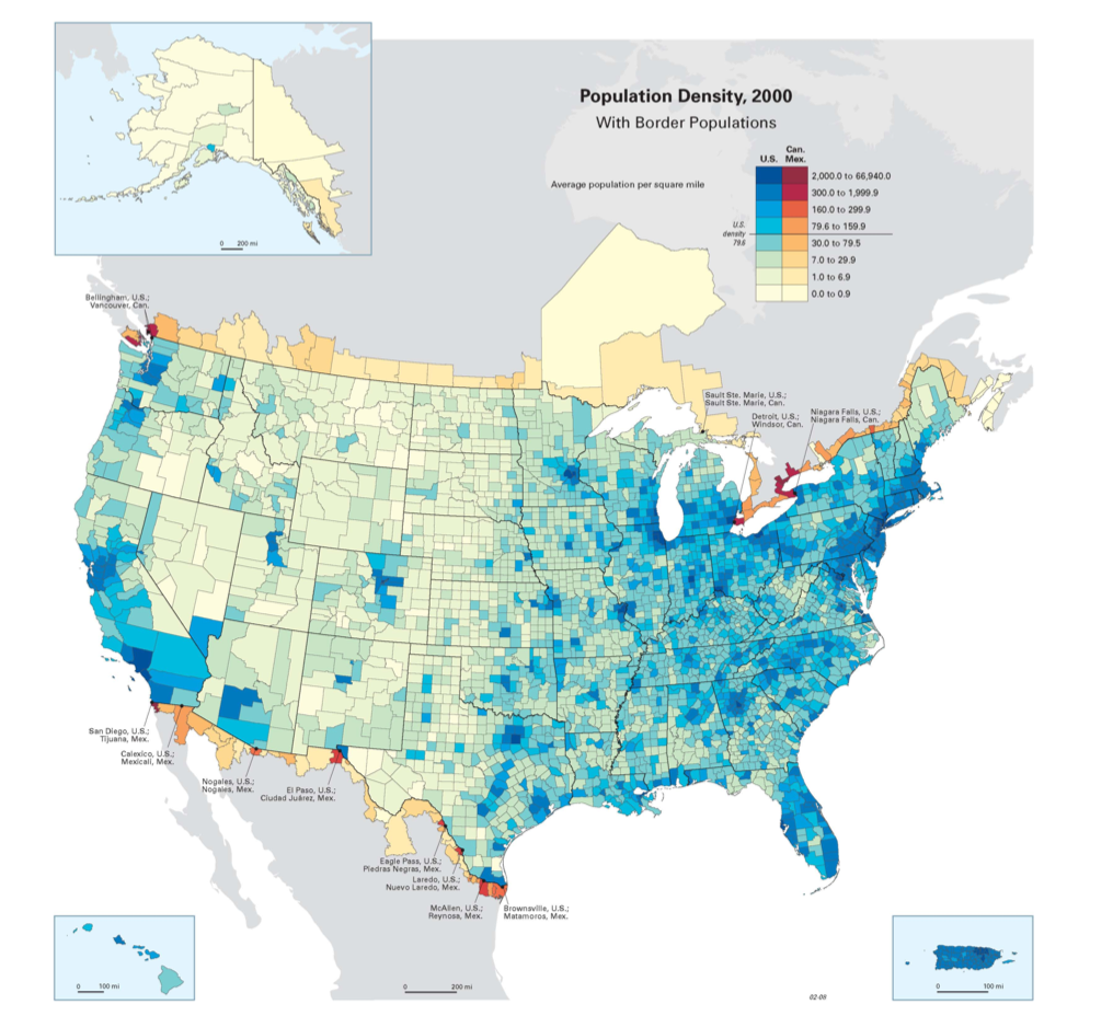
I found this map when searching for a map of population density and found it on this website: http://www.sport-touring.net/forums/index.php?topic=34954.0. The people on the message board where wondering why there were no motorcycling shows in Denver, interesting, I know. They found that the population wasn't very dense in the area and perhaps that was why they didn't have a show there. This map shows the highest population density in dark blue and the lighter the color, the less population density. It also shows cities close to the U.S. borders in reddish colors. I found this map interesting because the population is dense around the coastal areas in the west, but towards the east the population density starts east of the Midwest and increases towards the coast from there. Also I was surprised to find how little most of the west coast is high in population density.
Subscribe to:
Posts (Atom)
