
I found this map by searching for old maps of Los Angeles County on this website : http://www.wrd.org/engineering/historic-groundwater-los-angeles.php. This map shows contours for groundwater elevation in 1904. At this time there was so much groundwater in the area that much of the LA basin had flowing artesian wells. This map first grabbed my attention by its antique look and green shades. It had contour lines to shows the levels groundwater, lines that show streets of the time, and the Newport- Inglewood fault line. What I particularly found interesting about this map is that the name of my hometown, Downey, is represented very largely on the map. I wonder if that was the name of the water basin or if Downey played a large role in the county in 1905.

I found this map when searching for demographic maps on this website: http://www.streetprophets.com/storyonly/2007/8/28/201629/646. The person who posted it was also interested in maps. This map shows the percentage of obese adults in the U.S. by state in 2007. The green shades represent the states with the smallest percentage of obesity, or leanest states, then peach is higher in percentage of obese adults with the percentage increasing with the darker shade of red. I found this map interesting because I have never seen a map of the fattest states. I had no idea Colorado was the leanest state and Mississippi had the highest obesity rate.
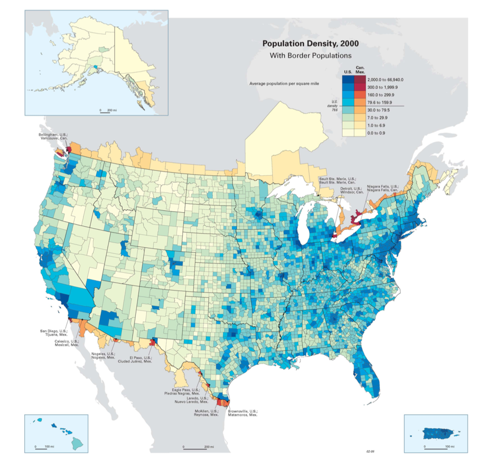
I found this map when searching for a map of population density and found it on this website: http://www.sport-touring.net/forums/index.php?topic=34954.0. The people on the message board where wondering why there were no motorcycling shows in Denver, interesting, I know. They found that the population wasn't very dense in the area and perhaps that was why they didn't have a show there. This map shows the highest population density in dark blue and the lighter the color, the less population density. It also shows cities close to the U.S. borders in reddish colors. I found this map interesting because the population is dense around the coastal areas in the west, but towards the east the population density starts east of the Midwest and increases towards the coast from there. Also I was surprised to find how little most of the west coast is high in population density.

Interesting maps! The borderlands maps is interesting but I don't know what sort of information I'm supposed to take from it. I guess I don't see the analysis, but it looks like the message board people didn't either!
ReplyDelete10/10